In our digital world, everyone is facing information overload. This is especially true for overstretched journalists tasked with sifting through hundreds of pitches and news releases from us fellow public relations professionals on any given day to find the few nuggets of information they’re looking for to include in their stories.
 This abundance of information and all of the communications channels we have access to nowadays
create a real quandary for both members the media and PR folks pitching their stories and vying for coverage.
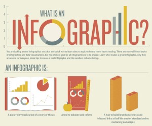
So as PR professionals, how do we cut through the clutter and grab the attention of inundated journalists? One answer lies in the infographic. You know, those elaborate maps or colorful charts you’ve seen in USA Today or TIME.
The media loves infographics – here’s why. Infographics save busy writers, reporters and bloggers a lot of valuable time by giving them the key takeaways they need from a particular report or news release, without having to read through it in its entirety. And because they are visual, they’re more interesting to look at than just words on a screen or a page. In fact, even if a journalist interested in your story idea doesn’t have the time or editorial space to pursue it, I’ve seen instances where he or she will instead run the infographic that you’ve provided as a standalone piece.
By now, hopefully you’re sold on the idea that you should be using infographics in your media relations strategy, but how?
First, it’s important to realize that infographics are a relatively new idea in both PR and journalism, so there’s still a bit of trial and error that comes along with deciding when and how to use them. But here are a few strategies that I’ve found helpful.
- Make sure that you have a legitimate data story to tell. If you’re working with pieces of data or survey findings that draw a clear conclusion, the infographic can definitely be a great way to highlight the key points that you want readers to know. But, if you’re compiling numbers into a graphic, which don’t really relate, the infographic will lack purpose and confuse your readers.
- Understand your audience. If you’re using an infographic to convey a data story that you’re hoping will get picked up by media outlets, be careful that it doesn’t look like a self-promotional marketing piece. Avoid incorporating any marketing language about your company or product that will deter a journalist from using it. There’s a big difference between an infographic that you’d share with your fans on your Facebook business page and one that you would share with an editor at The New York Times.
- Stay on point. This can be challenging, but it’s important to not to stuff too much information into one infographic. Stay on point to avoid cluttering up the infographic with redundant or unnecessary content.
Whether you are new to the idea of infographics or looking for ways to make your infographics more effective and compelling, one thing is certain, they are here to stay and every PR professional should be embracing them.